Discovering more
I created the complete identity for a new mobile brand—design systems, UX, packaging and motion—helping Cypher launch with clarity, confidence and a here-to-stay presence.
THE CHALLENGE
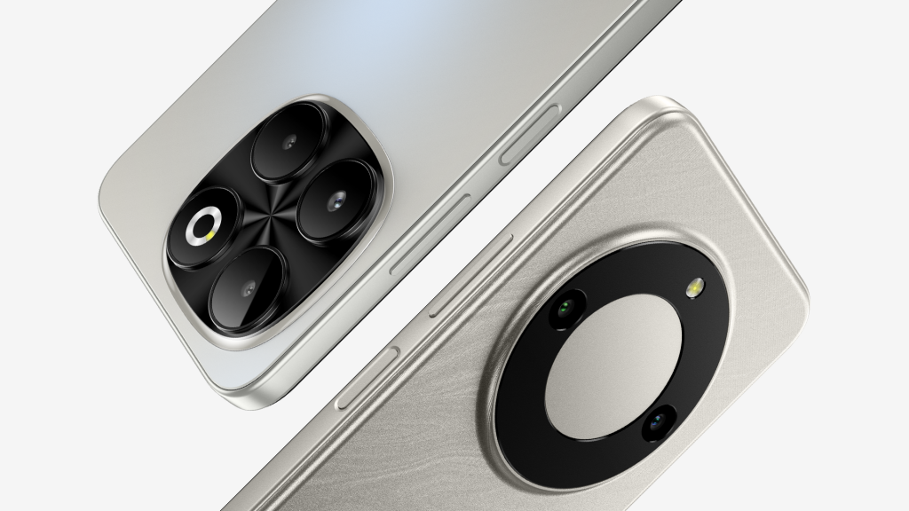
Cypher began as a new mobile brand headquartered in Dubai, created for everyday users who want technology that shows up, not shows off. With years of experience across Sony and major tech platforms, I was asked to build the brand from scratch: identity, art direction, UX, packaging and everything in between. Early research revealed something essential. People in this segment do not avoid affordable phones. They avoid brands that feel temporary. The strategic leap was clear: Cypher needed to look established from the moment it arrived, as if it were already part of the landscape. The challenge became how to take four white-label devices and create a brand that feels calm, dependable and genuinely here to stay from day one.
“David shaped a clear brand vision across every touchpoint, giving Cypher the identity and tools it needs to grow into a long-running value brand.”
THE SOLUTION
I built Cypher around the idea of discovery — a brand that reveals what matters and removes what does not. That single thought shaped every design and behaviour in the system.
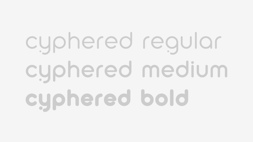
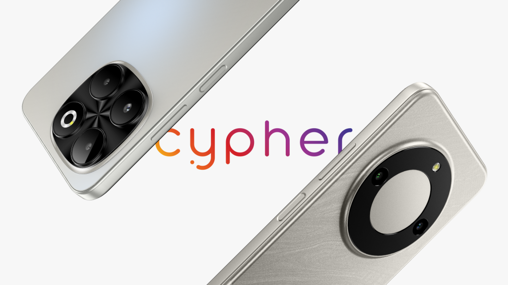
The name set the tone. The logotype carries a small dot-and-dash detail on the tail of the y, a quiet reference to encoded communication and the idea of meaning being revealed. Rounded, lowercase characters keep things warm and human, reducing visual noise and giving the brand a steady, approachable voice. This logic extended naturally into the bespoke typefaces, where select characters echo the signal language. The Series and OS naming systems follow the same internal logic, helping everything feel engineered, intentional and quietly confident.
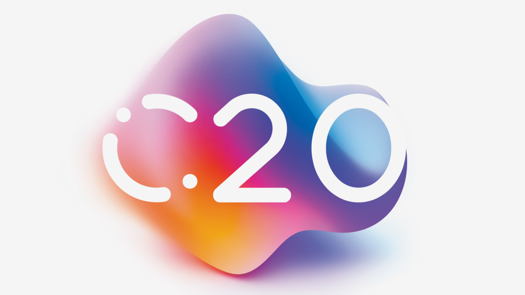
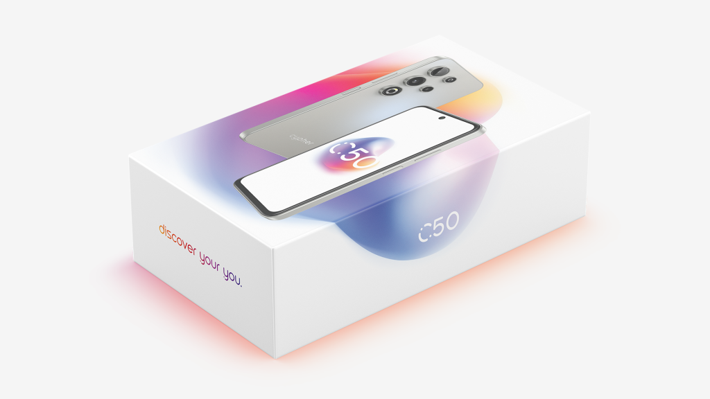
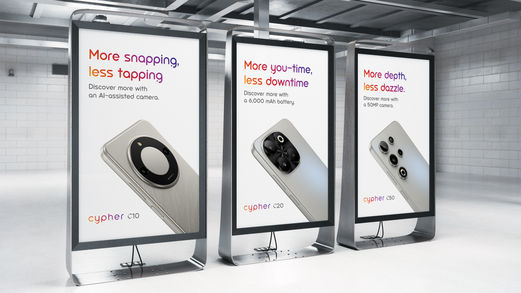
The art direction mirrors this sense of emergence. Layouts breathe. Information appears with intention rather than drama. Negative space becomes an active design tool. Early C-Series visuals explored refracted floating forms — shapes caught mid-transition — suggesting that the brand adapts around the customer rather than demanding attention. Even the colour philosophy follows this thinking. Full-spectrum gradients inspired by light refraction bring optimism into an otherwise minimal world, turning empty space into something purposeful. The verbal identity follows the same principle. It is calm, straight-talking and designed to reassure rather than impress.
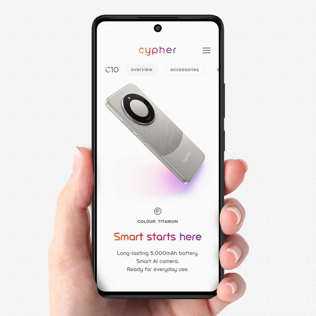
Alongside this, I designed the UX and UI for a multilingual rollout, mapping a user journey that feels clear and comfortable for low-tech audiences. With no budget for full 3D production, I relied on AI to generate device animations and conceptual environments. This made it possible to create around 200 visual assets for launch — e-commerce pages, PR materials, product displays and more — all consistent with the brand’s tone and behaviour.
Across all of this, the same principle guided the work: technology that shows up, not shows off.
THE RESULTS
“Cypher looks like a brand that already existed. David gave it the confidence and consistency it needed from day one,” said Kianoosh Valamanesh, Cypher’s Brand Director.
Cypher launched as a calm, trustworthy identity that directly answered the challenge. It looks established. It feels dependable. Every part of the system — the logotype, the typefaces, the colour philosophy, the motion language, the UX and tone — reinforces clarity, longevity and trust. The brand shows up exactly where it should, without noise or posturing, and feels built to last.
