Serving joy
I helped a friend turn his Dorset soft-serve hobby into a charming, music-pun-fuelled identity — a playful British-Japanese twist built for summer smiles.
THE CHALLENGE
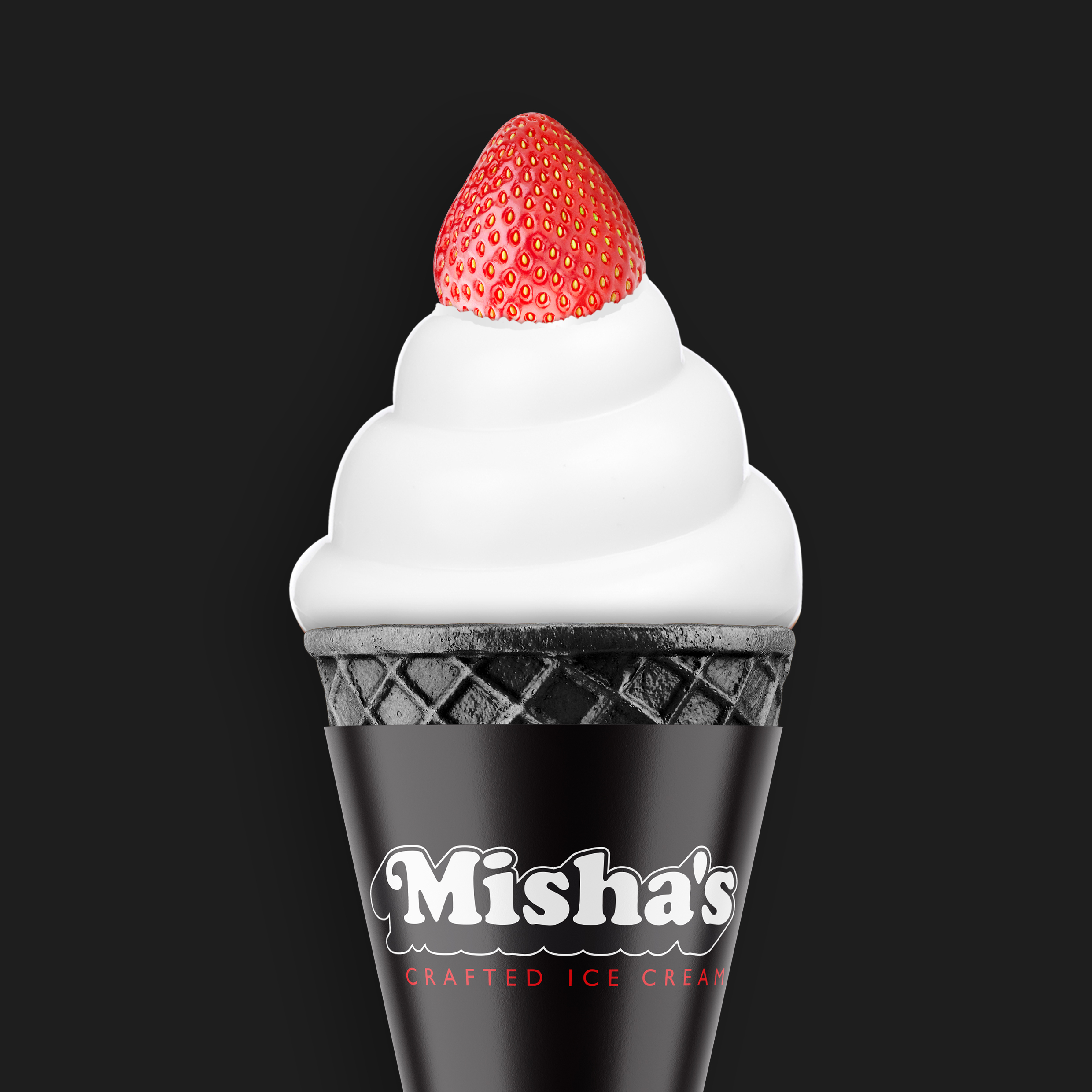
Some passion projects come along that are simply too sweet to turn down — especially when they’re dreamed up by a friend with a soft spot for soft-serve. A single-product Japanese-style ice cream, made with West Country dairy, crowned with a strawberry, and served from a summer-only setup in Dorset. Delicious, yes. But how do you give a tiny, one-man, zero-budget hobby the brand presence of a crowd-pleasing classic? And more importantly, how do you do it in a way that feels unmistakably British, proudly niche, and joyfully him?

“David turned my little summer idea into something I’m genuinely proud to stand behind. Thoughtful, fun, and far more considered than I ever expected. I couldn’t have asked for better.”
THE SOLUTION
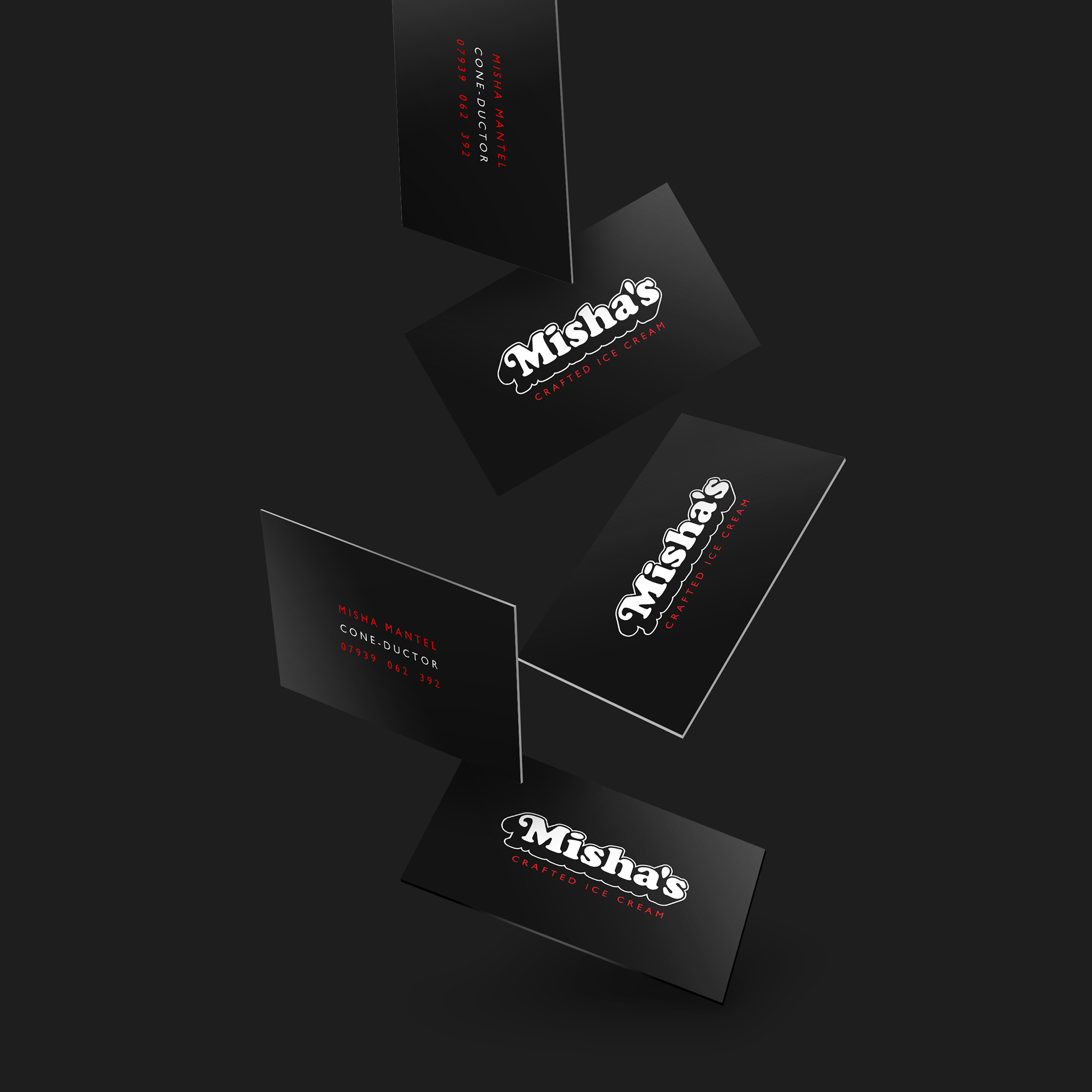
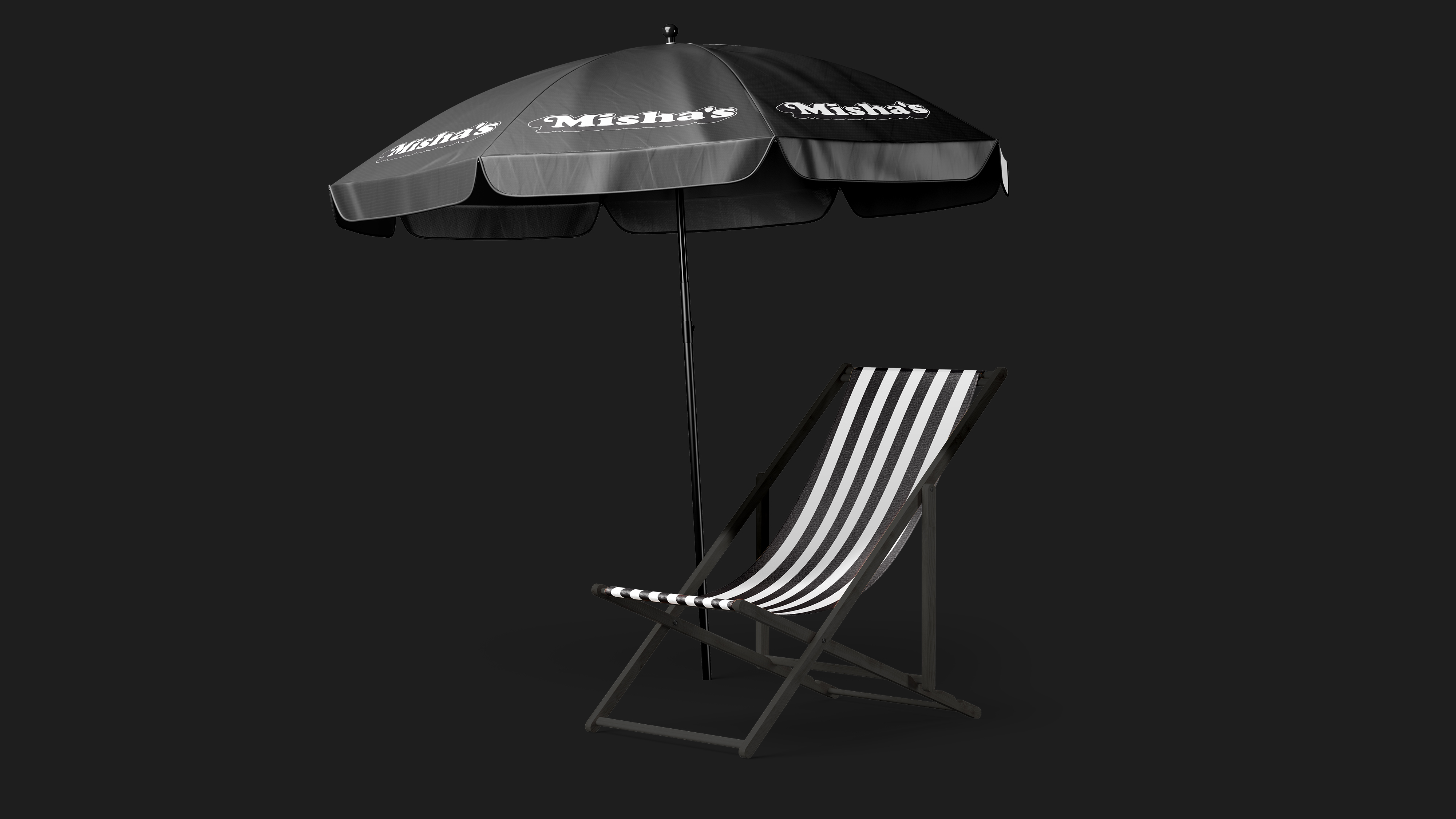
Leaning into the project’s playful spirit, I anchored everything around the idea of the twist — literal, cultural, and emotional. The strategy mixed British nostalgia with Japanese-inspired novelty: Copper Black typography for that seaside-heritage warmth, a near-black palette nodding to bamboo charcoal, and the “Disco” logotype — a soft-serve-esque extrusion that looked ready to swirl off the page.
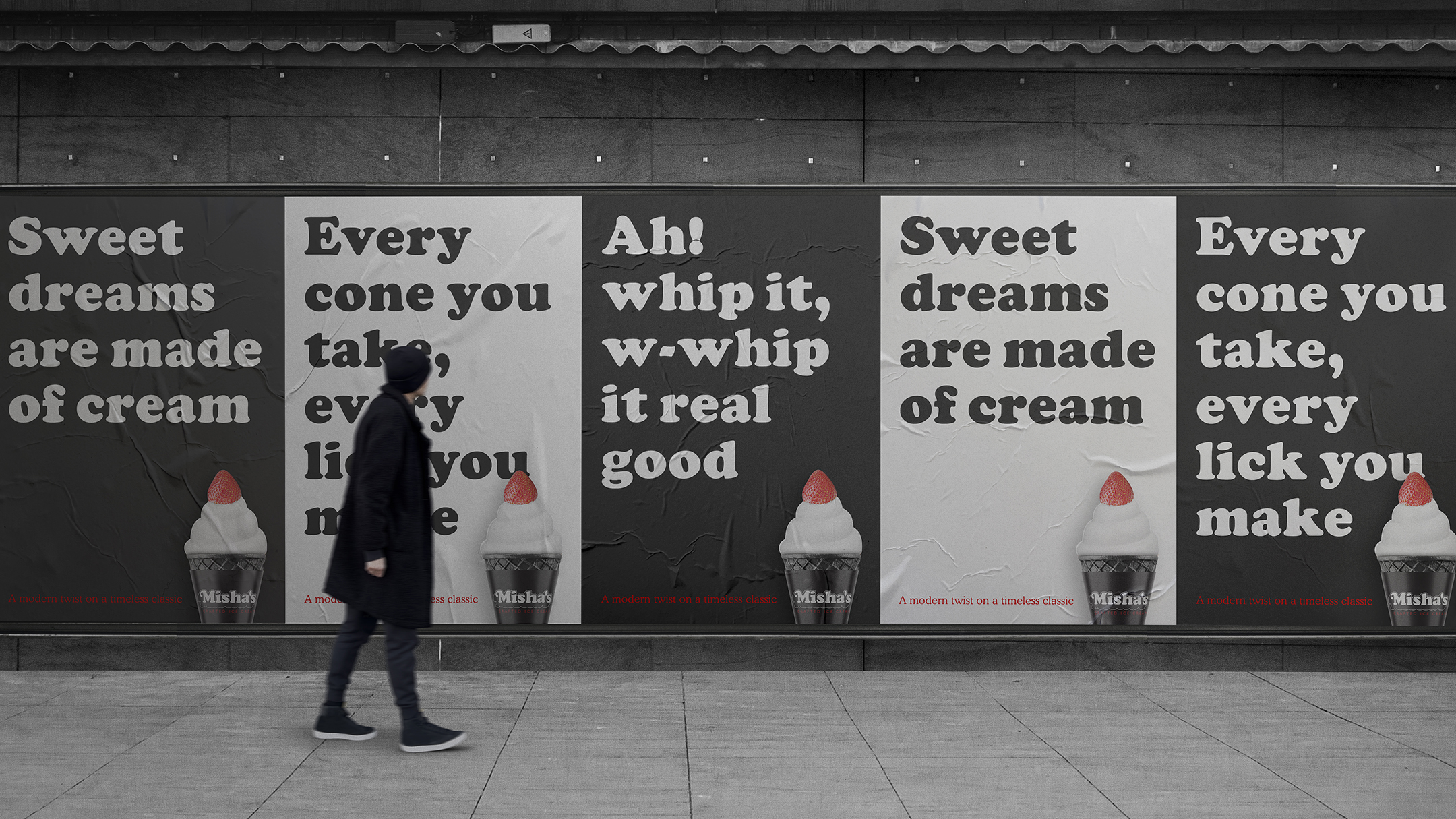
To keep the identity delightfully punny (because what’s more British than a warm day, a cold cone, and a terrible joke?), I built a campaign of reimagined song titles: “Sweet dreams are made of cream”, “Ah whip it… real good”, and other lyrical scoops. Each line doubled as a fun explanation of what makes the product different — without ever needing a paragraph of food-science justification.
Wrapped cones, cups, posters, tuk-tuk branding — everything carried that wink of joy. This wasn’t about corporate polish; it was about capturing the soul of a friend’s passion and serving it with a smile. The kind of side project I love: small brief, big heart, fully embraced.
THE RESULT
Upon seeing the final identity, Misha offered a wonderfully gushing reaction: “David didn’t just brand my idea — he elevated it far beyond hobby territory. The identity is clever, charming and so confidently put together that people assume I’m running a full-scale operation. It’s everything I hoped for, and so much more.”
For a small Dorset summer venture, that’s the kind of result that counts. A passion project wrapped in proper craft, ready for fetés, fields and festival queues.


